Intro:
It is no secret that an authentic dining experience is one of the best ways for restaurants to stay successful, but how can signage improve and add to the authenticity of the dining experience? Read on to find out!
Neon Signage – Building Nostalgia and Personality
Neon is one of the most inspirational and creative ways to enhance the dining experience because there are so many different ways to apply this type of illumination to build a specific authentic feeling.
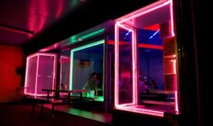
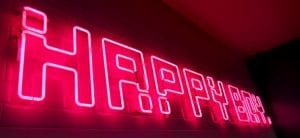

When produced using traditional glass, neon can help us reflect on the past with a warm feeling of nostalgia, or it can build personality with retro techno aesthetics.
For example, the sign we produced for Happy Boy used neon accent lighting together with the internal neon signage to build a warm nostalgic feeling. This type of signage paired with the right colours and font choices is very expressive which makes it a powerful marketing tool to build authentic emotion that adds to the dining experience.
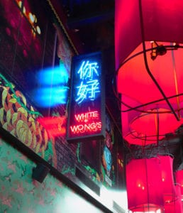

Comparatively, the neon we fabricated and installed for White & Wong’s has a very different aesthetic and feel. By using bright red and blue caged neon, we have a achieved a bespoke “china town” vibe which enhances the authentic Asian cuisine experience. The mesh cage also adds another element of illumination by giving the neon light something to interact with.
This enhances the theme of the restaurant and complements the 400 square metres of stunning printed wallpaper.
It is safe to say that neon signage is probably the most artistic form of illuminated signage out there because of its power to achieve authenticity in so many different ways.
Digital Signage – Futuristic Feels and Adaptive Promo Signage.
LED and HD screens are getting cheaper, more accessible and adaptable by the day which is improving the way we can use them for signage solutions to market restaurants, bars and cafes. Most restaurants and cafes only use digital signs to display their ever-changing menus but there are so many more applications and possibilities.
With animated motion graphics and video content, we can create an enhanced experience of the restaurant/cafe/bar and its branding. The possibilities are endless in today’s information and technology-driven world. Some restaurants even use projectors and HD screens to build an experience that lends itself to a futuristic feeling.
3D Illuminated Letters – Directional Illumination
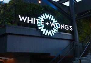

This type of illuminated signage is best for external use with its front face directional illumination. Unlike neon, LED light is directional, projecting the light outwards instead of in 360-degrees. This makes it ideal for external use on your restaurants or cafe’s fascia and building. These large illuminated letters signal the “grand entrance” of the establishment, much like the one we produced for White + Wongs in Newmarket. Customers experience the large illuminated letters fully as they make their way up the stairs of the restaurant and this builds excitement and anticipation of the experience to come.
We also use this type of signage to help set you apart from your competitors. It can be customised and fabricated in a way that enhances the authentic or unique experience of the restaurant and the food there. For example, the signage we made for Bake My Day has a warm and soft yellow front faced outward illumination that reflects the idea of warm freshly baked bread and adds to the experience of enjoying bespoke baked savoury treats.


Another great example is the way we used RGB shift LEDs inside the White + Wong’s external signage to help build a vibrant and colourful feeling that reflects the authenticity of Asian street culture. Movement is scientifically proven to attract more attention which will build more interest and lead to more patrons.
Tavern and Under Veranda Signs Don’t Have to Be Boring.
For many restaurants and cafes, it is mandatory to have an under veranda sign but that doesn’t mean it has to blend into its surroundings. This is an opportunity to get your restaurant’s message of authenticity across to the public which will increase the foot traffic into the business. It is also useful to attract people walking along the footpath. It helps them see the location of the business when the fascia above the footpath is not visible.
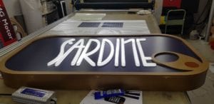

It is possible to print almost anything on a translucent vinyl for a lightbox and we can create a lot of interest and focus using “block out vinyl” for areas that shouldn’t illuminate. This helps to create contrast between the wording and the background so that the signage is more legible. For Sardine, we used a combination of 3d laser cut text and block out to add more dimension to the signage.


