Signage is a business cost, and the messaging needs to hit the mark.
This article goes into detail about what matters most to new car buyers based on studies and statistics to uncover the do’s and don’t when it comes to marketing messaging through signage channels. Each point includes some signage tips that help increase successful “money-making” signage.
Signage That Validates The Necessity of a New Car.
According to a 2019 AA Insurance Lifestyle Survey*, about 23% of Kiwi drivers say that they drive less than they did a year ago. The survey also found that there has been a drop in daily drivers in New Zealand by 7% between 2018 and 2019 alone. This means that Kiwi drivers are quickly learning with the help of the public transport system, that a new car is a responsibility and a liability in terms of safety and finance.
To keep selling cars despite this growing realisation amongst consumers, it is important to validate the purchase as much as possible. The new car needs to solve as many problems and headaches for the customer as possible. As marketers and salespeople, we do this by identifying as many problems as possible by getting to know your individual prospects better and asking the right questions. From experience with our customers in the automotive sales space, we have identified some great questions to start with:
- How much boot space do you need?
- What frustrates you about driving?
- Is driving at night challenging?
- Do you need car play?
- Is parking a problem for you?
- Is your car safe enough?
A lot of the latest driving technology solves many of these problems and it is these solutions that will help validate the new purchase.
Signage Tips:
- Include some of these questions in your printed adverts.
- If your salespeople drive company cars, get them sign-written with these thought-provoking questions.
- Include signage like this on the demo models as a reminder for customers to look out for this problem-solving feature during the test drive.
The Power of Empathy In Your Printed Messaging:
An article written by David Mayer and Herbert M. Greenberg in The Harvard Business Review* explains that empathy in the salesperson involves active listening that makes space for the right questions to be asked and for the salesperson to be more accommodating in the ways that truly matter to the individual. What truly matters to the buyer is how well their needs and wants are understood and met.
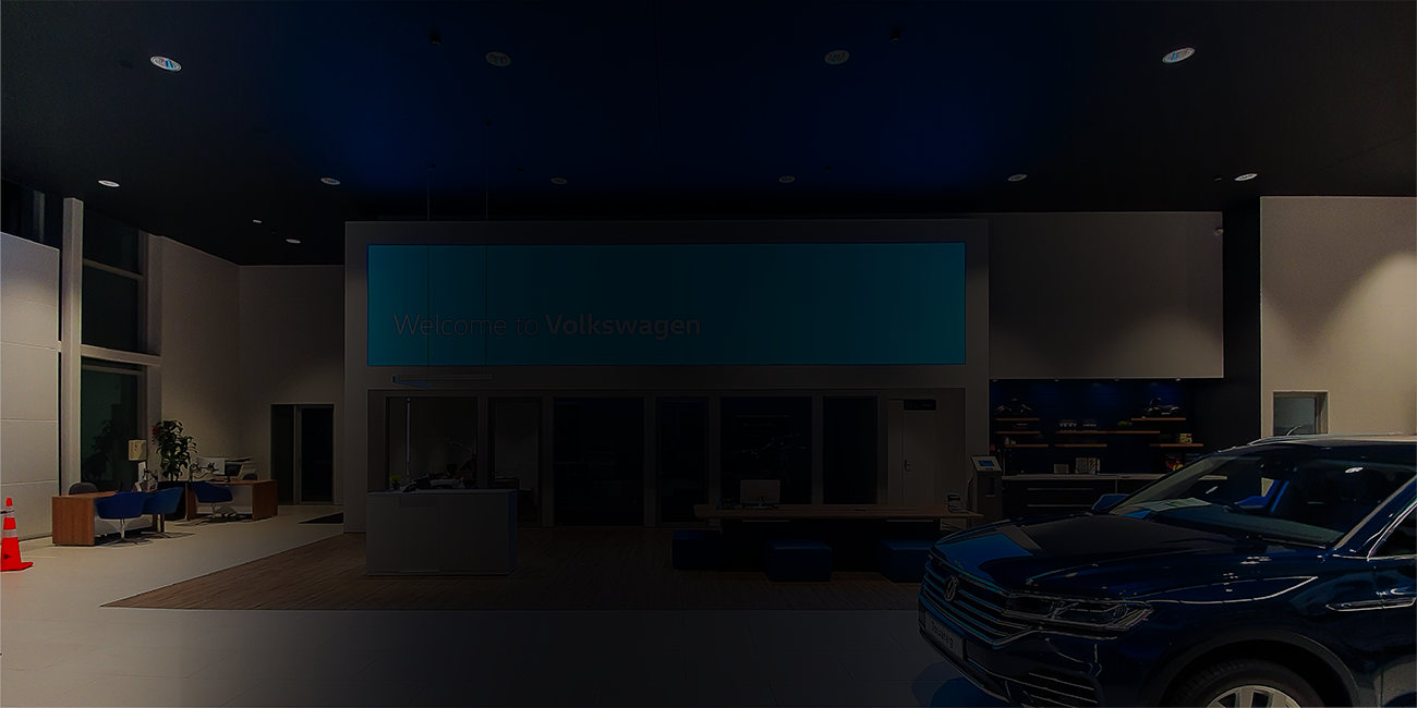
Signage and printed messaging can help to support this important purchasing influencing factor. By including printed messaging of empathy and care for the customer’s needs in the buying space, you encourage better communication between salespeople and purchasers. Better communication between the seller and the buyer ensures that the buyer’s needs are cared for and met. We have found that something as simple as a “welcome” sign is enough to achieve this. Some of our clients go as far as having signs in their toilet stalls to remind customers that “We’re here to help you.”
Signage Tips:
- Welcome signage.
- “How can we help you” signage.
- “Talk to our friendly staff” signage.
- Any messaging that supports an empathetic attitude towards the customer.
Attractive Signs Make The Cars Look More Attractive.
A study done by J.D. Power in 2016 called The Auto Avoider Study* showed that 55 % of new car buyers recognised that the look and style and/or colour of the vehicle to be the main reason for their new car purchase. Reliability came only third.
After this valuable and game-changing study, almost all car brands have really upped their game in terms of the look and stylistic appeal of their latest models. Kia is a great example when they decided to invest in more expensive upholsterers for their new cars to combat some of the negative stereotypes associated with the brand in terms of perceived quality and comfort. Kia has since moved its branding and offering into a more luxurious space in terms of style and looks. Have a look at the new Kia Carnival 2021 for example*.
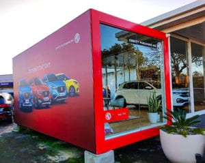
It would be a shame to spend so much money and effort to improve the look of the latest models and then use cheap and unattractive signage to promote them. By using high-quality display signs and bespoke fabricated signage we can use signage to, in a sense, “dress up” the vehicle on display to improve and enhance the look of it and make it that much more desirable.
Signage Tips:
- Use signage that is as good looking as the vehicles on display.
- Use high quality printed signage of promotional photography that shows off the looks of the car.
- Dye Sublimated prints for displays is the most effective way to show off the looks of the car because the vibrancy of the printed fabric brings the scene to life and highlights the most attractive aspects of the vehicle.
- Ensure there is consistency in perceived value between the signage that promotes the brand and the brand itself.
- Ensure the signage assets you invest in are durable and not likely to easily break or fail.
- Ensure the artwork you print is high resolution.
The Best Signage Strategy to Promote Safety
If we have a look at the top-selling car in New Zealand for 5 years running, we notice that the Ford Ranger has an impeccable safety rating and safety is a feature that New Zealand drivers value, particularly those Kiwi’s who have families.
According to Auckland Transport*, the death toll on the road has almost doubled in Auckland and serious injuries have more than quadrupled. Many drivers will be concerned with safety ratings than before and if your brand carries a good safety rating then it would be a loss not to include that feature on your promotional material.
If your brand has an average safety rating then the best option is to build on the positive association with the brand to solidify brand reliability and brand trust.
Signage Tips:
- Custom branded display stand with safety features outlined on the display. The dye-sublimated fabric helps to really make the high visibility safety colours pop. This type of sublimation is similar to the kind of dyeing techniques used to make high-vis safety gear.
- Include family-friendly elements like whiteboards for drawing on for kids. That way parents feel like their family needs are taken into account. It is also important to link this kid-friendly space to the brand so that those positive associations are built with the brand in the mind of the parents (buyers).
- Include signage elements with messaging that appeal to family common values like trust and patience.
- Use the relevant safety language in your messaging for promotional signage like “driver assistance” and “collision avoidance systems.”
Why We Always Double Check The Pricing Is Correct Before Hitting “Print”.
In any industry, we try to focus more attention on value instead of price to be successful. AutoWeb Inc CEO, Jared Rowe* mentions that statistically, about 20% of new car buyers want the lowest possible price on a car. The other 80% want a fair price. This 80% is the obvious focus area for your marketing efforts.
If you are looking at getting signage that would include the pricing of any of the vehicles on offer then it would be wise to make sure that the pricing is consistent with anything offered online. Get your marketing team to double-check this. At Signwise, we encourage our customers to double-check when we receive promotional artwork with pricing on for signage assets.
Signage Tips:
- Include a QR code in the printed sign/advert that allows the customer to scan and check the price online.
- Don’t approve artwork that includes pricing until the price is double-checked and confirmed.

References:
- One In Four Kiwis Drive Less – AA Insurance
- The U.S. AVoider Study – J.D. Power
- David Mayer and Herbert M. Greenberg in The Harvard Business Review – What Makes a Good Salesman?
- 2021 Kia Carnival Interior Spyshots Surface Internet, Gets An Elegant-looking Dashboard – India Auto Blog
- Monthly Crash Statistics, Road Deaths and Serious Injuries- Auckland Transport
- AutoWeb Inc – Jared Rowe


