Intro:
Plant walls are becoming increasingly popular in the hospitality industry because of its power to add calm to an otherwise busy and noisy restaurant. A plant can be customised and tailored to the brand and the dining experience to lend its many benefits while supporting the brand and the experience of the restaurant. Read more on how we are using plant walls to enhance the restaurants we work with:
Biophilic Design and Its Effects.
Biophilic design is designing with plants and natural plant elements and it is growing in popularity for very good reasons. People need nature and we want to be close to it instinctively. With enough plants, you can turn your restaurant into a calming getaway for your customers.
People are also more likely to take photos and share experiences on social media when there are natural and aesthetically pleasing elements incorporated in the space. No one wants to take a selfie in a Countdown, but with a gorgeous wall of greenery as your photo backdrop, it is difficult to fight the urge to share a beautiful photo of your experience with your online community.

It is also important not to underestimate the power of social media and signage. For example, the signage we produced for Big Boys Toys of the laser cut acrylic stag head and neon “Free Beer” sign was so popular that everyone had been taking selfies with the sign at the event resulting in a huge increase of supporters. Had we known beforehand how successful this sign would be at creating a memorable experience and generating more customers, we would have paired it with a bespoke plant wall and made the sign twice as big.
Using the Right Kind of Plants to Build Authenticity.
It is important to make sure your plant wall does not clash with the experience and aesthetic you are trying to achieve. The plants should not look out of place in its surroundings. We try to pair plant types that make sense with the type of food being served. For example, a steak house would do well paired with succulents or grass, depending on what is most appropriate to the experience you are trying to create.
Creating Tranquillity:
It is becoming very important to incorporate natural elements into busy retail spaces to combat the stress and cut through the chaos. It goes without saying that being in and around nature has a calming effect on us naturally as humans.
Restaurants are beginning to see the advantages of incorporating more natural elements into their spaces because it creates a tranquil environment that is worth coming back to when your patrons feel stressed out, thereby generating repeat customers.
Pairing Plant Walls with Illuminated Signage.
Nothing is more effective at drawing customers into your business than the right combination of illuminated signage and natural contrasting plant elements. The contrast between nature and technology is endlessly intriguing and is a great way to build excitement.
Not only does this signage strategy work well to grab all the right kind of attention, but it is also very customisable and can easily be tailor to achieve the aesthetic and feel that you are trying to achieve for the overall dining experience.
This “and breath” neon sign below helps to create a feeling of relaxation and calm. It would be ideal for a cosy cafe or a boutique restaurant where the experience is all about being relaxing and getting away from your busy day for a moment to take a breath. The idea here is also clever because of the fact that plants produce oxygen for us to breath.

The Hub sign and respective plant wall are in high contrast to the “and breath” sign. It reinforces feelings of cleanliness and efficiency and would be ideal in a corporate cafe setting or a cafe that is situated near an office or office park catering mostly to working people enduring working hours.

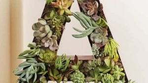
A true signage craftsman could even put the garden wall inside the 3D letters for an added level of interest and unique quality like this letter “A” that is filled with beautiful succulents.


 Back
Back
