When your customers are looking for a place to eat out there are usually an overwhelming amount of options available. It is important to make sure your signage is functioning competitively to ensure your restaurant or cafe is not out of sight (and mind) to your customers.
Custom Wallpaper:
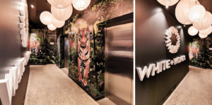
Custom wallpaper is a popular tool used to offset the space and make the dining experience a lot more interesting. Many restaurants print custom textures and patterns that reflect the branding while some cafes prefer to use wallpaper as a means to build the experience but printing scenery or authentic looking textures.

For example, the White & Wong’s wallpaper we print and install in Newmarket helps to set the scene for each dining space and section off areas to create better intimacy for diners. The wallpaper is also simultaneously functioning to make the dining experience more authentic with traditional Asian patterns and textures.
This gives diners a playground of colour and vibrance to keep them immersed in the experience while they wait to be served, which will buy your servers and staff more time to deliver exceptional service because the wallpaper adds more talking points for your guests to use while they wait.
Read more about our Custom Wallpaper Signage Solutions here
Internal Illuminated Signage:
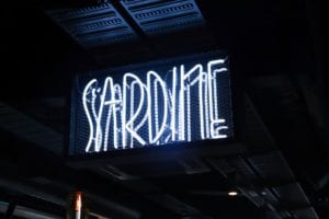
We use internally illuminated signage to entice customers and draw them into your restaurants as opposed to your competitors by using soft, inviting lighting that is on brand and conveys the right message of dining experience and authenticity.


There are many different illuminated signage options like neon and front faced illumination with a halo effect, or even a combination of two or three types of illumination. These light-up signage options are designed to draw people in and grab attention. We use light diffusion techniques and colour tinting to achieve the desired hue with the optimum level of light intensity to create an inviting effect without being too harsh on the eye.
External Signage Positioning & Contrast:
It is important to bear in mind the location of your restaurant or cafe. Some Hospitality businesses are unfavourably located off of the main street or in an inconvenient place to park, and signage experts can help to combat these logistical problems to drive more customers into your business.
Assessing the traffic through the area and working with architects and owners is very important so that we can identify the optimal position to direct the signage so that people passing by can’t miss it. It is also important to assess the surroundings to make sure there will be enough contrast between your signage and the rest of the street. This helps for better legibility.
Here are the different types of illumination you can use and where they work best:
-
Front-Lit LED Illumination:
The is where the front of the letter in illuminated and it works best when facing vehicle traffic main roads and highways because it is bright enough to catch attention from drivers. This is ideal if your restaurant is street-facing.
-
Halo Effect:
This is when we use directional LED illumination on the back of the sign to give the signage an accented illuminated effect. This type of illumination works best inside your restaurant or cafe for effect and ambience.
-
Neon Illumination:
Neon is great because it works for almost everything when fabricated and executed correctly. As long as the design is not too intricate then neon is your best friend for any restaurant or cafe both internal and external.
-
A Hybrid:
It is also possible to really improve the visibility of your hospitality business using combing different and complementary type of illumination based on what works well for your brand.
By using the right kind of illumination and materials we can achieve the highest level of contrast between the signage and its surroundings which will ultimately increase the reach of the sign and have an effect on the likelihood of foot traffic wandering into your business.


For Example, we positioned the Soho Quarter 3D illuminated building signage on the corner of the building, elevated above the fascia so that the only competing visual element the sign has is the stars and sky in the background. The sign is almost removed from the business of the street which allows for optimal contrast. In signage, the rule is that the higher you fix the sign the more visible it becomes as it “detaches” from the bustle on the ground level.


